Tuesday, 12 March 2013
Final Package
This is my template for my final packaging, the blank one shows my development of the net and the finished one shows my four pieces of information; name, vector skills, hand drawn skills, photographic skills,
Vector Logo Experiments.
This is my further development of my logo ideas; experimenting with typeface and composition. I've tried to display it in a way in which shows my thinking and design process.
Wednesday, 13 February 2013
Colsubsidio Book Exchange
A great representation of logo/identity and how simple you can make famous logos/identities whilst still being recognisable.
Sunday, 3 February 2013
Friday, 1 February 2013
Jerzy Goliszewski
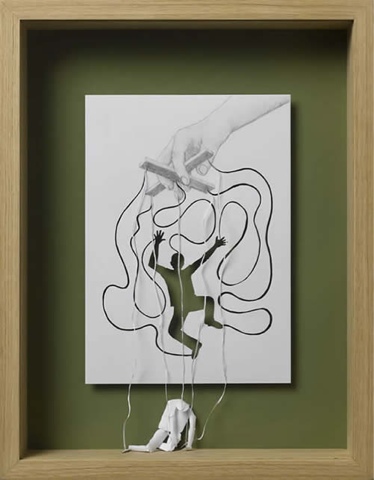
This is an installation that I found quite interesting as it combines the paper folding techniques along with the cut-away/reveal aspect that I am looking into.
Wednesday, 30 January 2013
Tuesday, 29 January 2013
Emil Kozole
A fantastic example of self promotion done with a minuscule amount of supplies, to show consciousness of the on going recession
"Since we are in a recession, brief was to make a self identity with as little money we can. First I created a simple logo from my first two letters that is easy to reproduce. I had a lot of waste papers at home which were blank on the other side and I could use them for bussines cards. The problem was how to cover the used side. I remembered of stencils, and had the logo carved out of plexi glass(1€). I used black spray paint because I had it at home and it covers almost everything. So the bussines cards were printed on the back side of used papers, I cut them and spray paint them with stencils. Same can be done with maps, sketch books and other stuff. Simple identity for 1€"
"Since we are in a recession, brief was to make a self identity with as little money we can. First I created a simple logo from my first two letters that is easy to reproduce. I had a lot of waste papers at home which were blank on the other side and I could use them for bussines cards. The problem was how to cover the used side. I remembered of stencils, and had the logo carved out of plexi glass(1€). I used black spray paint because I had it at home and it covers almost everything. So the bussines cards were printed on the back side of used papers, I cut them and spray paint them with stencils. Same can be done with maps, sketch books and other stuff. Simple identity for 1€"
Subscribe to:
Comments (Atom)


